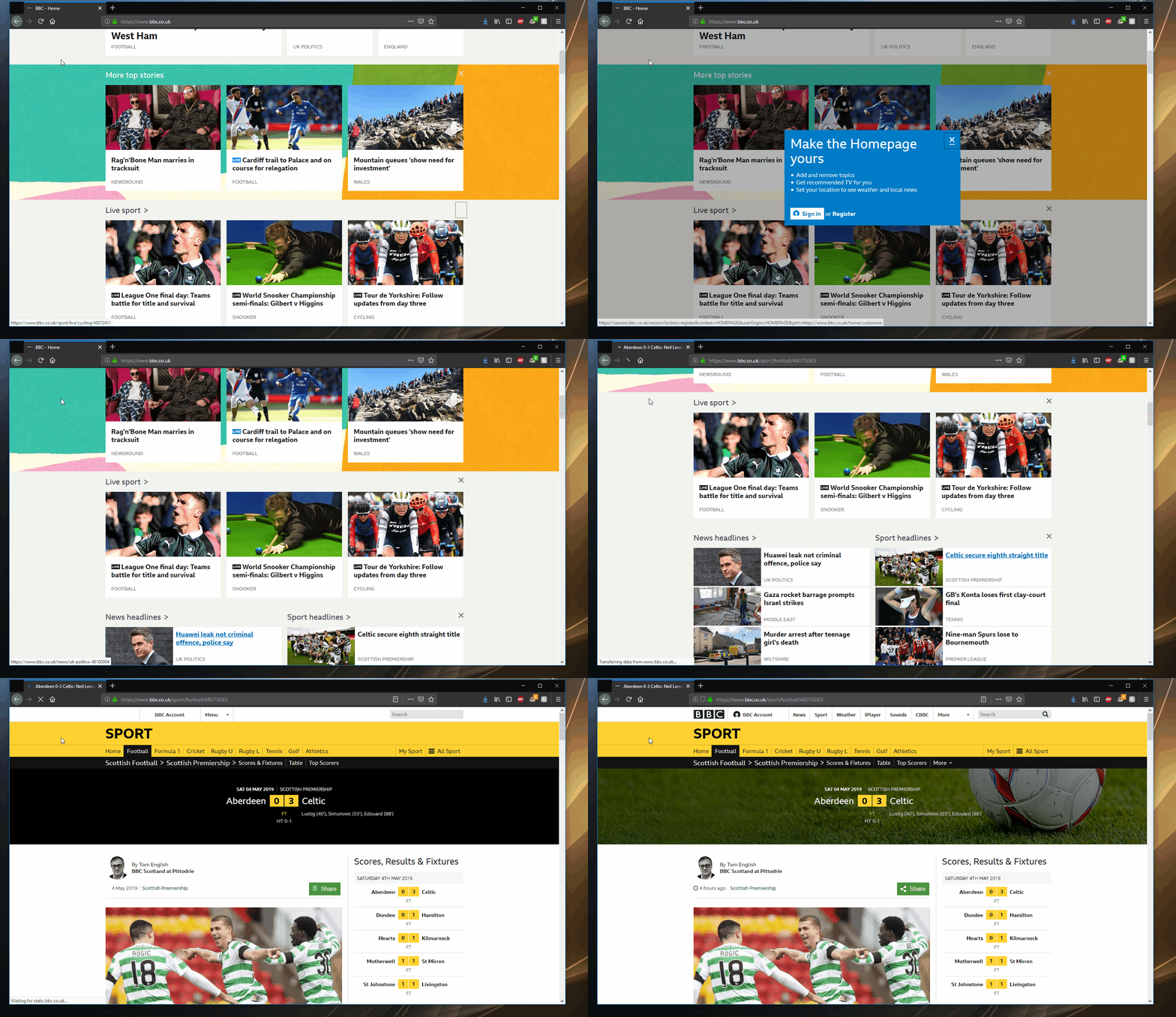
Test Accessibility like you resize your browser
Resizing our browser window to try and spot cosmetic bugs in our apps is almost second nature, but why aren't we doing the same for Accessibility?
I was at the React JS for Girls conference in London recently and a great talk from Marcy Sutton really stood out. To me it really highlighted how we often overlook accessibility when building our web apps.
When it comes to spotting a cosmetic bug we’ve found in our app, chances are it's happening because we're doing this...

Resizing the window is second nature to most of us. We write some code, we check it in the browser and within a few seconds we've got this twitch going on with our mouse.
So why aren’t we doing the same with accessibility?
When was the last time you "tabbed" through your web apps, seeing how easy it was to navigate around with the keyboard alone? When was the last time you used a screen reader during development and testing of your apps?

Everyone on the project needs to think about accessibility, not just developers
If accessibility is left up to developers, because "they're building the app", we may as-well not have testers or anyone reviewing our apps. Make sure everyone treats and tests accessibility like they would with any other part of an app.
Highlight accessibility early in the project
When we put tasks against building apps, there’s normally a team of us estimating how long things will take. Make sure accessibility considerations are brought up and time is put against: design, implementation and testing. If it’s not being actively discussed, raise it in your next sprint retrospective.
Designers need to have a bigger say in accessibility styles
Take for example designing a button, it should no longer just be how it looks in a flat design. There needs to be thought on what happens with the other action states like "active" and "focus". As developers, if they are not supplied, ask for them! Never be forced to remove that default outline without a good alternative being supplied.
Wrapping up
- Make it a habit (just like you do with resizing your browser window) to manually test accessibility.
- Take advantage of using browser testing tools like axe.
- Visit Marcy Sutton’s Empathy Driven Development project on GitHub. There are tonnes of linked resources to steer you in the right direction.
- If you don't know much about accessibility and the impact it does when you're not considering it in your apps, there's a useful beginners guide to Accessibility worth reading.


